Blue is one of the most popular and calming colors in the world, but have you ever wondered what the opposite of blue color is? Understanding color theory and opposites can help you create balanced designs, improve your artistic skills, and even enhance your understanding of color psychology. This article will explore everything you need to know about the opposite of blue color.
Color theory plays a vital role in design, art, and even everyday life. Knowing the opposite of blue color can help you create visually appealing compositions and evoke specific emotions. Whether you're an artist, designer, or simply someone interested in colors, this article will provide valuable insights into the world of color opposites.
In this guide, we will discuss the science behind color opposites, how they work, and their applications in various fields. By the end of this article, you'll have a deeper understanding of blue color opposite and how to use it effectively in your projects.
Understanding Color Theory
Color theory is the foundation of understanding how colors interact with each other. It involves the study of colors, their properties, and how they can be combined to create visually appealing results. At the heart of color theory lies the color wheel, which is a tool used to visualize the relationships between colors.
The color wheel is divided into primary, secondary, and tertiary colors. Primary colors include red, blue, and yellow. Secondary colors are created by mixing two primary colors, such as orange (red + yellow), green (blue + yellow), and purple (blue + red). Tertiary colors are created by mixing primary and secondary colors.
Understanding color opposites is an essential part of color theory. Opposite colors, also known as complementary colors, are located directly across from each other on the color wheel. When placed next to each other, complementary colors create a vibrant contrast that can enhance visual appeal.
What is the Opposite of Blue?
Blue's Opposite on the Color Wheel
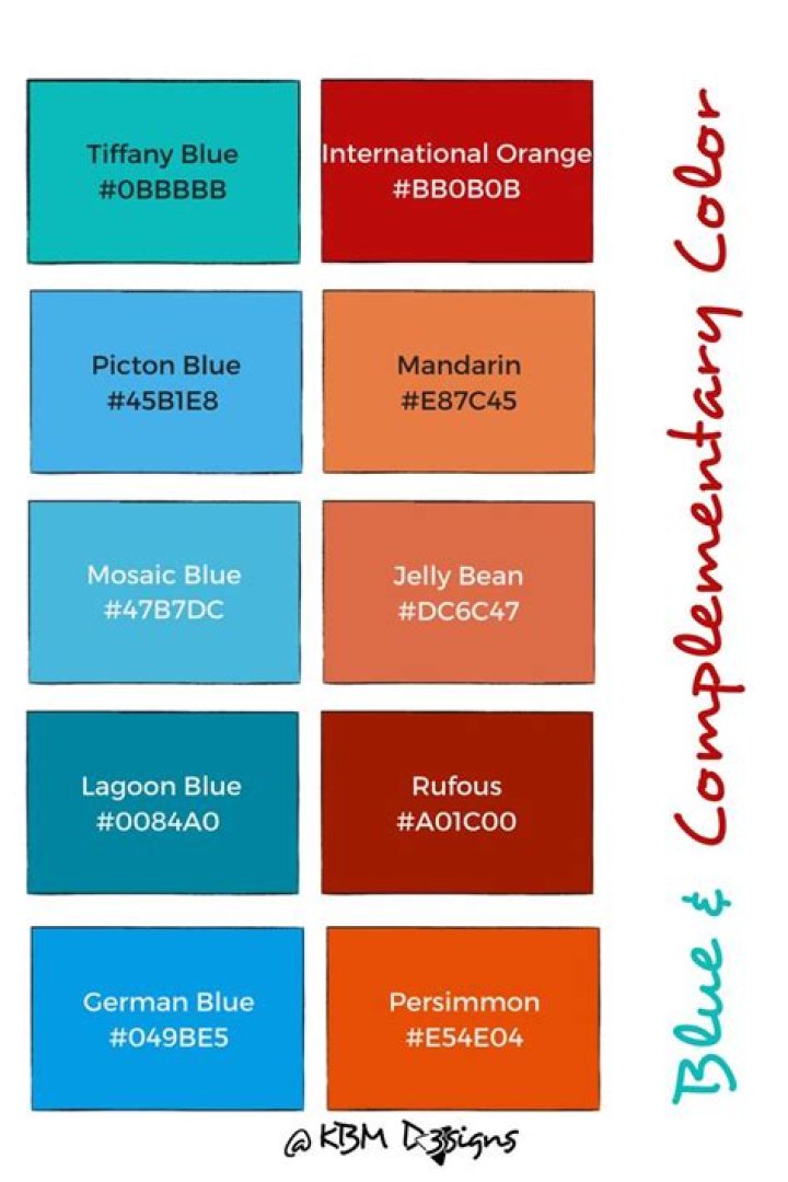
The opposite of blue color is orange. On the color wheel, blue and orange are positioned directly across from each other, making them complementary colors. This relationship creates a striking contrast that can be used effectively in design, art, and other creative fields.
Orange is a warm color, while blue is cool. This contrast in temperature adds to the visual impact of these complementary colors. When used together, blue and orange can create a balanced and harmonious composition.
The Role of the Color Wheel
How the Color Wheel Works
The color wheel is a circular diagram that arranges colors in a logical sequence based on their relationships. It helps artists, designers, and other creatives understand how colors interact with each other. By using the color wheel, you can identify complementary colors, analogous colors, and triadic color schemes.
Complementary colors, like blue and orange, are positioned opposite each other on the color wheel. This arrangement creates a dynamic contrast that can be used to draw attention or create balance in a design. Analogous colors are adjacent to each other on the wheel, while triadic colors form a triangle when connected on the wheel.
Color Psychology and Opposites
The Emotional Impact of Blue and Its Opposite
Color psychology explores how colors influence human behavior and emotions. Blue is often associated with calmness, trust, and stability. It is a popular choice for corporate branding and is widely used in healthcare and technology industries.
Orange, on the other hand, evokes feelings of warmth, energy, and enthusiasm. It is often used in marketing to encourage action and stimulate appetite. The contrast between blue and orange can create a powerful emotional response when used together.
Understanding the psychological effects of color opposites can help you make informed decisions when designing spaces, creating marketing materials, or choosing color schemes for your projects.
Applications of Color Opposites
Where Complementary Colors are Used
Complementary colors like blue and orange are widely used in various fields, including design, art, marketing, and fashion. In design, complementary colors can create striking visuals that capture attention and convey specific messages. For example, a blue background with orange text can make the text stand out and improve readability.
In art, complementary colors are used to create depth and contrast. Artists often use blue and orange to add dimension to their work and evoke strong emotions. In marketing, complementary colors can enhance brand recognition and make advertisements more memorable.
Some industries rely heavily on complementary colors to convey their message. For instance, the food industry often uses orange to stimulate appetite, while blue is used in technology and finance to convey trust and reliability.
Using Blue and Its Opposite in Design
Tips for Designers
Designers can use blue and orange effectively by understanding their properties and how they interact with each other. Here are some tips for using complementary colors in design:
- Use blue as a dominant color and orange as an accent to create balance.
- Experiment with different shades and tones of blue and orange to achieve the desired effect.
- Consider the context and purpose of your design when choosing complementary colors.
- Test your design with different audiences to ensure it conveys the intended message.
By following these tips, designers can create visually appealing and effective compositions that leverage the power of complementary colors.
Blue and Its Opposite in Art
Artists' Perspective
Artists have long recognized the power of complementary colors like blue and orange. These colors can create a sense of depth and movement in a painting or drawing. When used together, blue and orange can evoke strong emotions and add visual interest to a piece of art.
Some famous artists, such as Vincent van Gogh and Henri Matisse, have used complementary colors extensively in their work. Van Gogh's "Starry Night" features a blue sky with orange accents, while Matisse's "The Dance" uses blue and orange to create a dynamic composition.
Artists can experiment with different techniques to incorporate complementary colors into their work, such as layering, blending, and contrasting.
Color Opposites in Marketing
How Businesses Use Blue and Orange
In marketing, complementary colors like blue and orange are used to grab attention and convey specific messages. Blue is often associated with trust, reliability, and professionalism, making it a popular choice for corporate branding. Orange, on the other hand, is energetic and inviting, making it ideal for promoting products and services.
Many successful brands use blue and orange in their marketing materials. For example, Firefox uses a blue background with an orange logo to create a memorable and engaging brand identity. Similarly, Mastercard uses blue and orange in its logo to convey trust and energy.
By understanding the psychological effects of color opposites, marketers can create campaigns that resonate with their target audience and drive results.
Blue Opposite in Fashion
Trends in Fashion Design
In fashion, complementary colors like blue and orange are used to create bold and eye-catching outfits. Designers often use these colors to add contrast and interest to their collections. For example, a blue dress with orange accents can make a statement at a formal event, while a blue jacket with orange sneakers can add a pop of color to a casual outfit.
Fashion trends often incorporate complementary colors to stay fresh and innovative. Designers experiment with different shades and textures to create unique looks that appeal to a wide range of audiences.
When choosing outfits, consider the context and occasion to ensure your color choices align with the desired mood and message.
Conclusion
In conclusion, understanding the opposite of blue color and how it interacts with its complementary color, orange, can enhance your skills in design, art, marketing, and fashion. By leveraging the power of complementary colors, you can create visually appealing compositions that evoke strong emotions and convey specific messages.
We encourage you to explore the world of color theory and experiment with different combinations to find what works best for your projects. Don't forget to share your thoughts and experiences in the comments section below. For more insights into color theory and design, check out our other articles on the website.