Blue is one of the most popular colors in the world, but what color is the opposite of blue? This question has intrigued artists, designers, and color enthusiasts for centuries. Understanding the concept of color opposites, also known as complementary colors, is essential for anyone interested in visual arts, interior design, or even fashion. In this article, we will delve into the fascinating world of color theory to answer this question comprehensively.
The concept of complementary colors is not just theoretical; it has practical applications in various fields. By understanding the opposite of blue, you can create more vibrant designs, enhance visual contrast, and even improve your photography skills. Whether you're a professional artist or simply curious about colors, this article will provide you with all the information you need.
Join us as we explore the science behind color opposites, the history of color theory, and practical tips for using complementary colors effectively. Let's dive in and discover what color is truly the opposite of blue!
Understanding Color Theory
Color theory is the foundation of all visual arts. It provides a framework for understanding how colors interact with each other, how they can be mixed, and how they affect human perception. At its core, color theory revolves around the concept of the color wheel, which was first introduced by Sir Isaac Newton in 1666.
The color wheel is a circular diagram that arranges colors in a logical sequence based on their relationships. It consists of primary colors (red, blue, and yellow), secondary colors (orange, green, and violet), and tertiary colors (combinations of primary and secondary colors).
Understanding the color wheel is crucial for identifying complementary colors. These are colors that sit directly opposite each other on the wheel, and when paired together, they create a striking visual contrast.
How Complementary Colors Work
- Complementary colors enhance each other's vibrancy when placed next to one another.
- They can create a sense of balance and harmony in design.
- When mixed, complementary colors neutralize each other, producing shades of gray or brown.
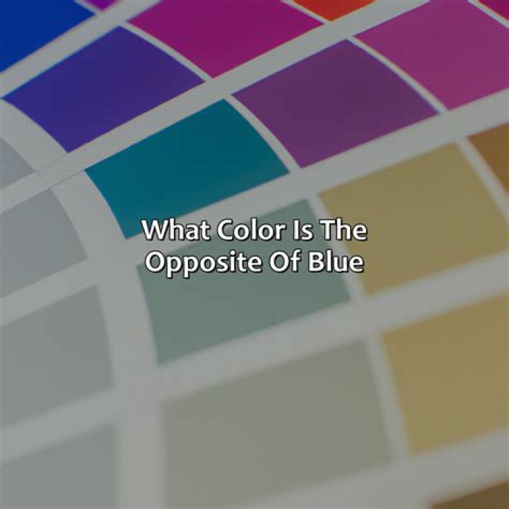
What Color is the Opposite of Blue?
The opposite of blue on the traditional color wheel is orange. This relationship is based on the RYB (Red-Yellow-Blue) color model, which is widely used in art and design. Orange is created by mixing red and yellow, the two colors that are adjacent to blue on the wheel.
In the context of color theory, blue and orange are considered complementary colors. When used together, they create a dynamic and visually appealing contrast. This is why you often see blue and orange combinations in logos, advertisements, and interior design schemes.
However, it's important to note that the opposite of blue can vary depending on the color model being used. In digital design, for example, the RGB (Red-Green-Blue) model is more relevant, and the opposite of blue in this model is yellow.
The Role of the Color Wheel
The color wheel is an indispensable tool for anyone working with colors. It helps artists and designers visualize the relationships between different hues and make informed decisions about color combinations.
In the RYB model, the color wheel is divided into three sections: primary colors, secondary colors, and tertiary colors. The primary colors are red, blue, and yellow, and they cannot be created by mixing other colors. Secondary colors are produced by mixing two primary colors, while tertiary colors are created by combining a primary color with a secondary color.
By using the color wheel, you can easily identify complementary colors. Simply locate the color you're working with and find the color directly opposite it on the wheel.
Types of Color Wheels
- Traditional RYB Wheel: Used in art and design.
- RGB Wheel: Used in digital design and lighting.
- CYM Wheel: Used in print and photography.
Complementary Colors in Action
Complementary colors are not just theoretical concepts; they have practical applications in various fields. In visual arts, for example, artists use complementary colors to create depth and contrast in their paintings. By placing blue next to orange, they can make both colors appear more vibrant and dynamic.
In interior design, complementary colors are used to create visually appealing spaces. A blue living room with orange accents, for instance, can create a warm and inviting atmosphere. Similarly, in fashion, complementary colors can be used to create bold and stylish outfits.
Photographers also rely on complementary colors to enhance their images. By understanding how colors interact, they can compose shots that are visually striking and emotionally impactful.
RGB vs RYB Color Models
When discussing the opposite of blue, it's important to consider the color model being used. The RYB model, which is based on pigments, is commonly used in traditional art and design. In this model, the opposite of blue is orange.
On the other hand, the RGB model is used in digital design and lighting. In this model, colors are created by combining red, green, and blue light. The opposite of blue in the RGB model is yellow, as blue and yellow light combine to create white light.
Understanding the differences between these models is essential for anyone working in both traditional and digital mediums. It allows you to make informed decisions about color choices and ensures consistency across different platforms.
Key Differences Between RYB and RGB
- RYB is based on pigments, while RGB is based on light.
- RYB is subtractive, meaning colors are created by subtracting light, while RGB is additive, meaning colors are created by adding light.
- In RYB, the opposite of blue is orange, while in RGB, the opposite of blue is yellow.
Practical Applications of Complementary Colors
Complementary colors have a wide range of practical applications in various fields. In visual arts, they are used to create dynamic and visually appealing compositions. Artists often use complementary colors to highlight certain elements in their work or to create a sense of movement and depth.
In interior design, complementary colors can be used to create balanced and harmonious spaces. For example, a blue bedroom with orange accents can create a calming yet energizing environment. Similarly, in fashion, complementary colors can be used to create bold and stylish outfits that stand out.
Photographers also rely on complementary colors to enhance their images. By understanding how colors interact, they can compose shots that are visually striking and emotionally impactful.
Examples of Complementary Color Combinations
- Blue and Orange
- Red and Green
- Yellow and Violet
The Psychology of Color Opposites
Colors have a profound impact on human emotions and behavior. This is why understanding the psychology of color opposites is essential for anyone working in visual arts, marketing, or design. Blue, for example, is often associated with calmness, serenity, and trust, while orange is associated with energy, enthusiasm, and creativity.
When used together, blue and orange can create a powerful emotional impact. The contrast between the two colors can evoke a sense of balance and harmony, while also stimulating the viewer's emotions. This is why blue and orange combinations are often used in marketing and advertising to grab attention and create a lasting impression.
Understanding the psychological effects of color opposites can help you make informed decisions about color choices in your work. Whether you're designing a logo, creating a piece of art, or decorating a space, the right color combination can make all the difference.
Color Theory in Art History
The concept of complementary colors has been a cornerstone of art theory for centuries. Artists throughout history have used color opposites to create dynamic and visually appealing works of art. One of the most famous examples is the work of Vincent van Gogh, who often used blue and orange in his paintings to create a sense of movement and depth.
In the early 20th century, the Bauhaus movement emphasized the importance of color theory in design. Artists and designers from this movement used complementary colors to create functional and aesthetically pleasing objects. This approach continues to influence modern design to this day.
Understanding the historical context of color theory can provide valuable insights into its practical applications. By studying the works of famous artists and designers, you can gain a deeper appreciation for the power of complementary colors.
Famous Artists Who Used Complementary Colors
- Vincent van Gogh
- Pablo Picasso
- Wassily Kandinsky
Design Tips Using Blue and Its Opposite
Whether you're a professional designer or a DIY enthusiast, using blue and its opposite can enhance your projects. Here are some practical tips for incorporating complementary colors into your designs:
- Use blue as the dominant color and orange as an accent to create a balanced look.
- Experiment with different shades of blue and orange to find the perfect combination for your project.
- Consider the context in which your design will be used and choose colors that complement the environment.
Remember, the key to successful color design is balance. Too much of one color can overwhelm the viewer, while too little can make the design feel incomplete. By using complementary colors thoughtfully, you can create designs that are both visually appealing and emotionally impactful.
Conclusion and Call to Action
In conclusion, the opposite of blue depends on the color model being used. In the RYB model, the opposite of blue is orange, while in the RGB model, it is yellow. Understanding the concept of complementary colors is essential for anyone working in visual arts, interior design, or fashion.
By using complementary colors effectively, you can create dynamic and visually appealing designs that capture the viewer's attention. Whether you're designing a logo, creating a piece of art, or decorating a space, the right color combination can make all the difference.
We invite you to explore the world of color theory further and experiment with complementary colors in your own projects. Share your thoughts and experiences in the comments below, and don't forget to check out our other articles for more insights into the fascinating world of colors!